

A ReactJS login box built using the FluentUI library. It features a basic structure, with customization options for each element:
- a title;
- a message area;
- a username field;
- a password field;
- a log-in button and;
- a password recovery button, which can be hidden.
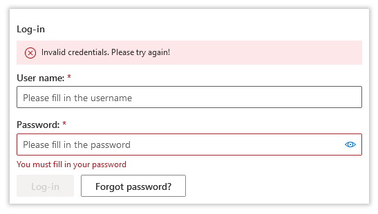
Here's a screenshot of how it all looks like using the default styling:
npm install --save lvd-fluentui-loginbox
The demo directory contains a compiled and ready-to-run example. Just open up the index.html file.
import React from 'react';
import { LoginBox } from 'lvd-fluentui-loginbox';

class LoginPage extends React.Component {
	constructor(props) {
		super(props);

		this._handleLoginRequested =
			this._handleLoginRequested.bind(this);
		this._handleForgotPasswordRequested =
			this._handleForgotPasswordRequested.bind(this);
	}

	_handleLoginRequested(loginValues) {
		//...trigger server side processing
	}

	_handleForgotPasswordRequested(loginValues) {
		//...navigate to password recovery page
	}

	render() {
		return (
			<LoginBox
				onLoginRequested={this._handleLoginRequested}
				onForgotPasswordRequested={this._handleForgotPasswordRequested}
			/>
		);
	}
}
You can find a full working example here.
You can either directly include the dist/style.css into your html web page or use the @import directive inside your stylesheet if building using webpack:
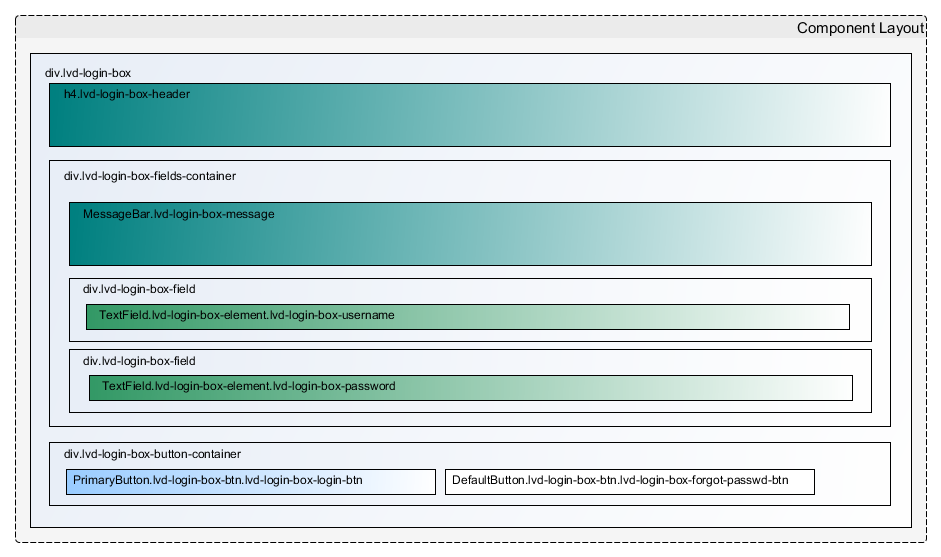
@import '~lvd-fluentui-loginbox/dist/style.css';If you need to customize the default styling or provide a new one altoghether, you may find this component layout diagram useful:
Also see the component itself.
To build the demo application:
npm run build-app
To build the library:
npm run build-dist
To build both in one sitting:
npm run build
| What | Prop Name | Type | Notes |
|---|---|---|---|
| Disable component | disabled |
boolean |
Cascades to all fields and buttons. Defaults to false. |
| Configure whether to use framed container layout or not | framed |
boolean |
If true, it will display the default shadow-box frame. Defaults to true. |
| Configure whether to use built-in fixed-width container layout or not | fixed |
boolean |
If true, it will set the container width to the default width of 500px. Defaults to true. |
| Configure whether to center the container or not | centered |
boolean |
If true, it will attempt to center the container. Defaults to true. |
| Set additional container css class name | className |
string |
Defaults to null. |
| Set additional inline css style properties | style |
object |
Key-value plain javascript object. Defaults to {}. |
| Make component readonly | readOnly |
boolean |
Cascades to all fields. Defaults to false. |
| Display fields in underlined style. | underlined |
boolean |
Defaults to false. |
| Component title | titleProps |
Title Customization Object |
See below. |
| Message | messageProps |
Message Object |
See below. By default no message is shown. |
| Username field | userNameProps |
Username Customization Object |
See below. |
| Password field | passwordProps |
Password Customization Object |
See below. |
| Log-in button | loginActionButtonProps |
Log-in Action Button Customization Object |
See below. |
| Forgot password button | passwordRecoveryActionButtonProps |
Password Recovery Action Button Customization Object |
See below. |
All the default values are defined here.
A plain javascript object with the following properties:
| Name | Type | Notes |
|---|---|---|
show |
boolean |
Defaults to true if not specified. |
text |
string |
Defaults to Log-in if not specified or empty. |
Example:
<LoginBox
	...
	titleProps={{
		show: true,
		text: "Log-in to access your account"
	}}
	...
/>A plain javascript object with the following properties:
| Name | Type | Notes |
|---|---|---|
message |
string |
The actual message to be displayed. Defaults to null if not specified. |
type |
LoginBoxMessageType |
Type of message - used for formatting (error, warning etc.). Defaults to null if not specified. See here for all supported values. |
Example:
<LoginBox
	...
	messageProps={{
		message: "Invalid credentials provided",
		type: LoginBoxMessageType.error
	}}
	...
/>A plain javascript object with the following properties:
| Name | Type | Notes |
|---|---|---|
label |
string |
Field label. Defaults to User name:
|
placeholder |
string |
Field placeholder. Defaults to Please fill in the username
|
description |
string |
Field descriptive text, displayed below the username field. Defaults to empty string. |
emptyErrorMessage |
string |
Error message displayed when the field is left empty. Defaults to You must fill your username
|
Example:
<LoginBox
	...
	userNameProps={{
		label: "User:",
		placeholder: "The username you set upon registration.",
		emptyErrorMessage: "The username is required!"
	}}
	...
/>A plain javascript object with the following properties:
| Name | Type | Notes |
|---|---|---|
label |
string |
Field label. Defaults to Password:
|
placeholder |
string |
Field placeholder. Defaults to Please fill in the password
|
description |
string |
Field descriptive text, displayed below the password field. Defaults to empty string. |
emptyErrorMessage |
string |
Error message displayed when the field is left empty. Defaults to You must fill in your password
|
canReveal |
boolean |
Whether or not to offer the option of revealing the password. Defaults to true if not specified |
Example:
<LoginBox
	...
	passwordProps={{
		label: "Password:",
		placeholder: "The password you set upon registration.",
		emptyErrorMessage: "The password is required!",
		canReveal: false
	}}
	...
/>A plain javascript object with the following properties:
| Name | Type | Notes |
|---|---|---|
label |
string |
Button label. Defaults to Log-in
|
Example:
<LoginBox
	...
	loginActionButtonProps={{
		label: "Sign-in"
	}}
	...
/>A plain javascript object with the following properties:
| Name | Type | Notes |
|---|---|---|
label |
string |
Button label. Defaults to Forgot password?. |
show |
boolean |
Whether to show the button or not. Defaults to true if not specified. |
position |
PasswordRecoveryButtonPositions |
Button alignment options. Defaults to PasswordRecoveryButtonPositions.left if not specified. |
Example:
<LoginBox
	...
	passwordRecoveryActionButtonProps={{
		label: "I forgot my password",
		show: true,
		//align password recovery button to the far-right of the container
		position: PasswordRecoveryButtonPositions.right
	}}
	...
/>The login values are exported as a plain javascript object with the following properties:
| Name | Type | Notes |
|---|---|---|
userName |
string |
- |
password |
string |
- |
| Event | Prop Name | Arguments | Notes |
|---|---|---|---|
| Values changed | onLoginValuesChanged |
(oldValues:Login Values Object, newValues:Login Values Object) |
Triggered whenever either of the user name or password field changes. |
| Login requested | onLoginRequested |
(Login Values Object) |
Triggered when the Log-in button is clicked. |
| Password recovery requested | onForgotPasswordRequested |
(Login Values Object) |
Triggered when the Forgot password button is clicked. |
| Component initialized | onLoginFormInitialized |
none |
Triggered when the component is mounted by React. |
| Component disposed | onLoginFormDisposed |
(Login Values Object) |
Triggered when the component is un-mounted by React. |
- Updated type definitions.
- Updated type definitions.
- Added type definitions.
- Added
framedprop to allow one to opt-out of the default framed/shadow-boxed container layout; - Added
fixedprop to allow one to opt-out of the default fixed-width container layout; - Added
centeredprop to allow one to opt-out of the default container centering; - Added
styleprop to allow one to pass arbitrary in-line css styling to the container; - Added
classNameprop to allow one to pass an additional css class to the container; - A description can now be passed to both the username and the password fields.
- Added
underlinedprop to allow one to display the login box fields using the underlined layout built-inFluentUifor theTextFieldcomponent; - Added
onLoginFormInitializedevent, triggered when the component is mounted byReact.
- First tracked version.
I put some of my free time into developing and maintaining this plugin. If helped you in your projects and you are happy with it, you can...
