
A multi-select component for CanJS

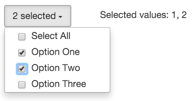
Demo
Here is a JSBin demo.
Installation
npm install multi-select --save
You can use any of the builds in the dist folder to meet your project needs.
Usage
Using CanJS's built-in support for StealJS, you can now import the module directly inside your templates. For example:
One Two Three {{#each items}} {{text}} {{/each}} All One Two ThreeWith all-selected-value the selectedValues will result in [-1].
Event delegation:
var onItemClick = function(context, el, ev, params){ console.log('Item was clicked with value=%s and isSelected=%s ', params.value, params.isSelected);}For can-2.2.x and older there will be an additional event triggered on the element and can be captured like this on the parent component with events:
events: { console; // -> {value: 5, isSelected: true, selectedValues: [5,6,7]} } API
- list: a list of items to use if no tags are rendered inside the component.
- selected: an array of selected items as objects with value and text properties.
- selected-values: an array of selected values.
- selected-items: an array of selected items if items are passed as list.
- are-all-selected: boolean, true if all options are selected.
- (itemclick): the handler will be called with 4 arguments by default:
- content,
- element,
- ev,
- params: {value: <itemValue>, isSelected: <boolean>, selectedValues: <array of selected values>}
Options:
- select-all: show "Select All" option. If value "default" is passed then all options will be preselected. Default: false.
- select-all-text: string to be shown for "Select All" option. Default: 'Select All'.
- all-selected-text: string to be shown when all items are selected. Default: 'All Selected'.
- all-selected-value: a value to be returned when all options are selected (e.g. if its -1, then selectedValues will result in [-1]).
- value-prop: property name to look up for value. Default: 'value'
- text-prop: property name to look up for text. Default: 'text'.
- selected-prop: property name to look up to check if an item should be selected. Default: 'isSelected'.
- disabled-prop: property name to look up to check if an item should be disabled. Default: 'isDisabled'.
- click-event-name: property name to look up to check if an item should be disabled. Default: 'itemclick'.
Changelog
0.3.0 - By default, when there is one item in the list, when that item is checked, the allSelectedText value will be the text of the checked item.
Contributing
Pull requests are welcome.
Authors